Moodle (LMS) Redesign
Case Study, UX/UI
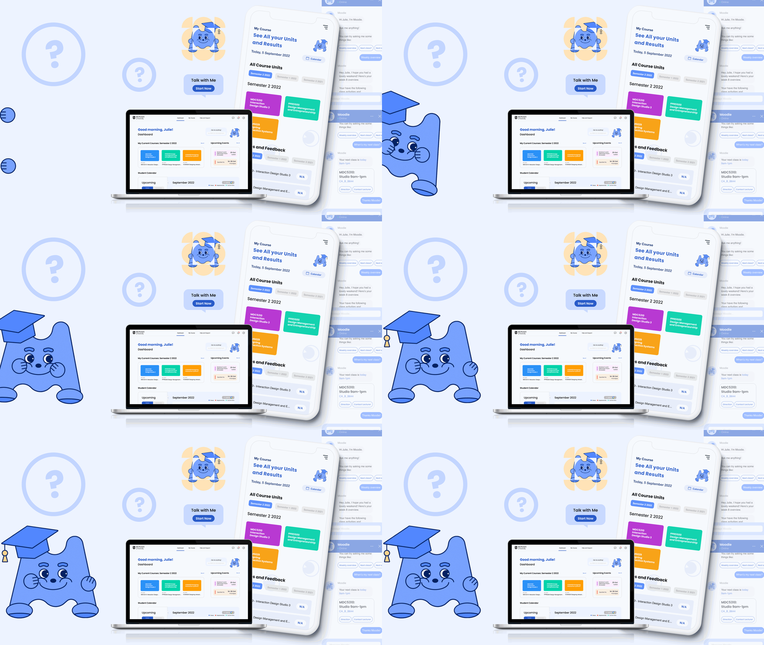
In collaboration with Monash University, our team of Interaction Design students embarked on a mission to enhance the usability of Moodle, the university's primary Learning Management System (LMS). Through interviews and usability tests, we delved into student interactions with Moodle, identifying pain points and opportunities for improvement. Our redesigns aimed to make navigation more intuitive and engaging for students. The final design, which won the MADA Now 2022 Interaction Design High Achievement Award, reflects our commitment to creating impactful solutions for educational technology.

CONTEXT
CONTEXT
YEAR
2022 (3 Months)
LOCATION
Melbourne, Australia
ROLE
UX Research, UX/UI Design, Prototyping
TOOLS
Figma, Protopie
Monash University has been using Moodle for approximately 10 years. In this time there have been many customisations and enhancements made to the platform to address functionality and technical needs. However, some major aspects like navigation, aesthetics and ease of use have not yet been addressed. This results in a powerful tool that is frustrating to use for students. As students of Monash University, we understand the frustrations and the confusions that students are experiencing especially for those who might not be familiar with the platform yet. We wanted to find out more about these issues by conducting further research from the students’ perspective to determine whether these are genuine problems and if there are any other underlying issues that we might not be aware of.
PROBLEM
According to our interviews and pre-interview usability test, all participants said they use Moodle almost everyday, however, we observed that the majority of participants had trouble with navigations and some functionalities within the platform as well as clarity issues when locating and understanding certain information on Moodle.
SOLUTION
Maintain interaction pattern consistency across different courses and units
Enhance content and visual hierarchy, main resources should be present in the most visible and convenient way
Simplify and clarify the process of assessment submission
Improve the accessibility of communication channels on the platform
Include onboarding to introduce new students to the platform
QUESTION
HMW make learning easy for new students so that they feel more welcome and have good experiences using the platform?
HMW enable better navigation so that students can locate their resources efficiently?
HMW improve interaction pattern consistency of the LMS so that students can easily accomplish their tasks?
-

EMPATHISE
-

DEFINE
-

IDEATE
-

PROTOTYPE
Usability Study
In this research, we conducted interview sessions and performed usability testing with Monash students who utilise Moodle as their primary platform for studies. Our objective was to acquire a deeper understanding of their experiences, insights, thoughts, and opinions regarding their current utilisation of Moodle. All Monash students have access to and are mandated to use Moodle for tasks such as accessing unit information and content, communicating with teachers, completing modules/quizzes, or submitting assignments.
We believed that conducting interviews with these target users would furnish us with valuable insights to pinpoint potential solutions for enhancing Moodle.
-
To investigate and observe how Monash students navigate around Moodle and discover the underlying issues from their experience.
-
Observe the end to end process of how Monash students currently use and navigate around Moodle
Improve Moodle’s navigation (logical hierarchy, simplicity and versatility)
To address issues with Moodle, offer solutions and propose to Monash University
Explore solutions to the underlying issues within Moodle to suggest to the client for further improvements
-
Objective 1 - Understand the end to end process of how Monash students currently use and navigate around Moodle
Objective 2 - Understand the significant reasons why Monash students use Moodle
Objective 3 - Investigate how Monash students approach issues that occur on Moodle
Objective 4 - Explore the potential opportunities of Moodle in adapting with future study at Monash
Objective 5 - Understand Monash students’ perceptions, emotions and thoughts towards their current experience with Moodle
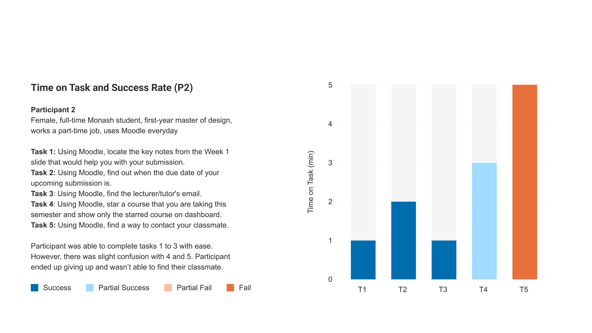
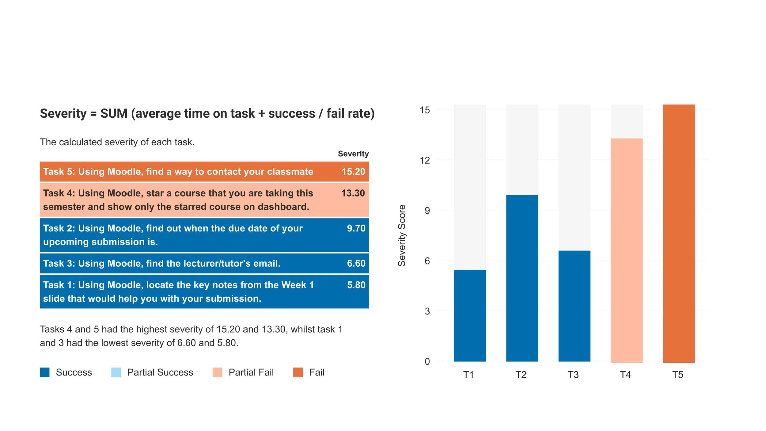
The usability testing for this Moodle study was conducted with five participants selected by Monash University. We began by providing a brief introduction about ourselves and the purpose of our study. Following that, we conducted a quick pre-test interview to learn a little about our users and their backgrounds with Moodle. Participants were then assigned five tasks to complete, each accompanied by complementary scenarios to aid in easier visualisation of the tasks. All participants were asked to follow the 'Talk Out Loud' method when completing each task, which allows us to easily recognise users' thought processes and pain points.
Usability tests were completed with a post-test questionnaire to gather any additional data, feelings, and thoughts that were not clearly conveyed during the tasks. Additionally, participants were asked to complete the ‘System Usability Scale’ (SUS) test, allowing us to measure the participants' overall test experience.


Interview
Interview sessions are arranged and conducted on-site, allowing our team to gain more insight directly from Moodle users and to understand them better. Our interview questions are constructed based on our objectives, including users' backgrounds, motivations for use, the end-to-end process of using Moodle, technical difficulties, and their overall thoughts and opinions. The interview participants are recruited and selected by MADA faculty members. We interviewed a total of eight interviewees, all of whom are Bachelor’s and Master’s degree students from Monash Design faculty.
After our interviews, we downloaded and edited every interview's transcriptions to share with the team. We also kept notes of participants' documentation and analysed the key quotes from every interview. From there, we performed thematic analysis using affinity mapping by coding the data into themes as well as brainstorming 'How Might We' questions.


User Persona & Journey Map
Key Insights & HMW Questions
-
HMW make it easier for students to find resources?
HMW design Moodle so there is less scrolling involved?
HMW improve Moodle’s layout consistency?
-
HMW improve students’ experience when submitting assessment?
HMW clarify submission process for Monash students?
HMW assist students when encounter submissions issues?
-
HMW make contents more organised?
HMW highlight important content?
HMW highlight key information on Moodle?
HMW avoid overloaded information on a single page?
-
HMW keep Moodle consistent across all courses/units?
HMW encourage teachers and staff to upload content in the same consistent way?
-
HMW improve the chat box?
5 Recommendations
Task User Flow Diagrams
WIREFRAMING
The Mascot
THE PRODUCT
[ Dashboard and My Courses ]
[ Unit Information and Resources ]
[ Assessment Submission ]
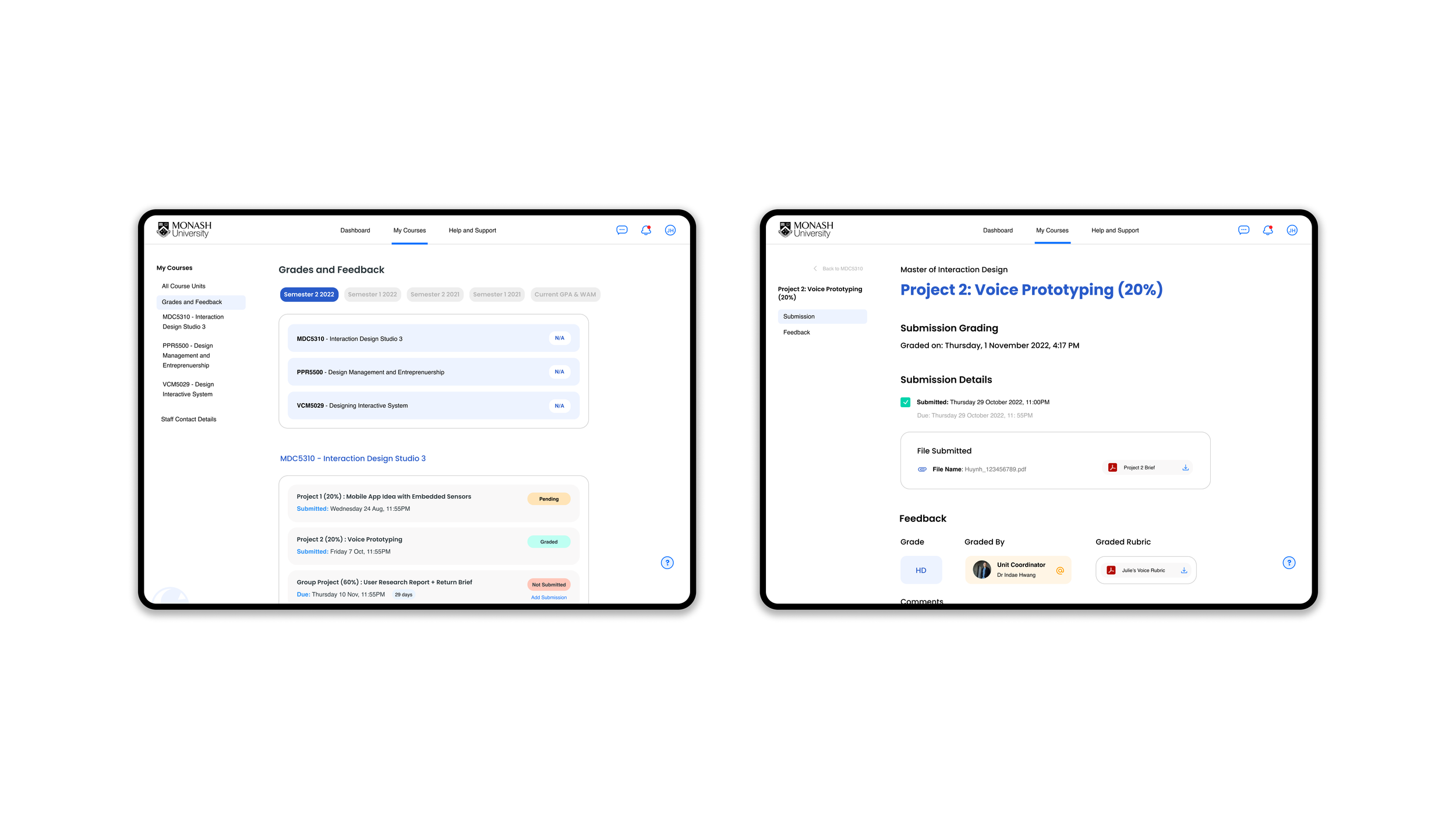
[ Grades and Feedback ]
[ Desktop Demo ]
[ Mobile Mockup ]
[ My Monash Page ]
Thank You!


